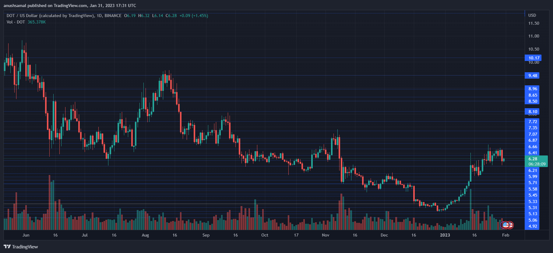
The Polkadot (DOT) price started to note a fall on its daily chart after Bitcoin could not stay above the $24,000 price.
Other significant altcoins followed suit with Bitcoin’s descent on its chart. Over the last 24 hours, DOT lost 3% of its market value. In the last week, the altcoin lost close to 6%.
The technical outlook also started to portray how the bulls were losing strength on the daily chart. Demand for the altcoin noted a downtick, which is why even accumulation fell on the chart.
With a fall in demand, DOT is headed toward its nearest support level, and a continued reduction in buying strength will push Polkadot below its support line.
If demand in the broader market improves with BTC appreciating and moving above the $24,000 mark, then demand for other altcoins, including DOT, will increase on its chart.
DOT must break past its overhead resistance to ensure that the coin does not incur further losses over the upcoming trading sessions. The market capitalization of DOT noted a decline, which meant that sellers had started to resurface in the market.
Polkadot Price Analysis: One-Day Chart

DOT was exchanging hands at $6.28 at the time of writing. The altcoin was quite close to its immediate support level of $6.20. This level acts as a crucial price zone for the altcoin, as a fall from its level will bring Polkadot to $5.70.
The overhead resistance for the coin stood at $6.60; breaching this level will help Polkadot secure $6.20 as its nearest support line.
The coin can also try to revisit the $7 mark if it breaks past the $6.70 level. The amount of Polkadot traded in the last session was green, indicating an increase in buyers on the one-day chart.
Technical Analysis

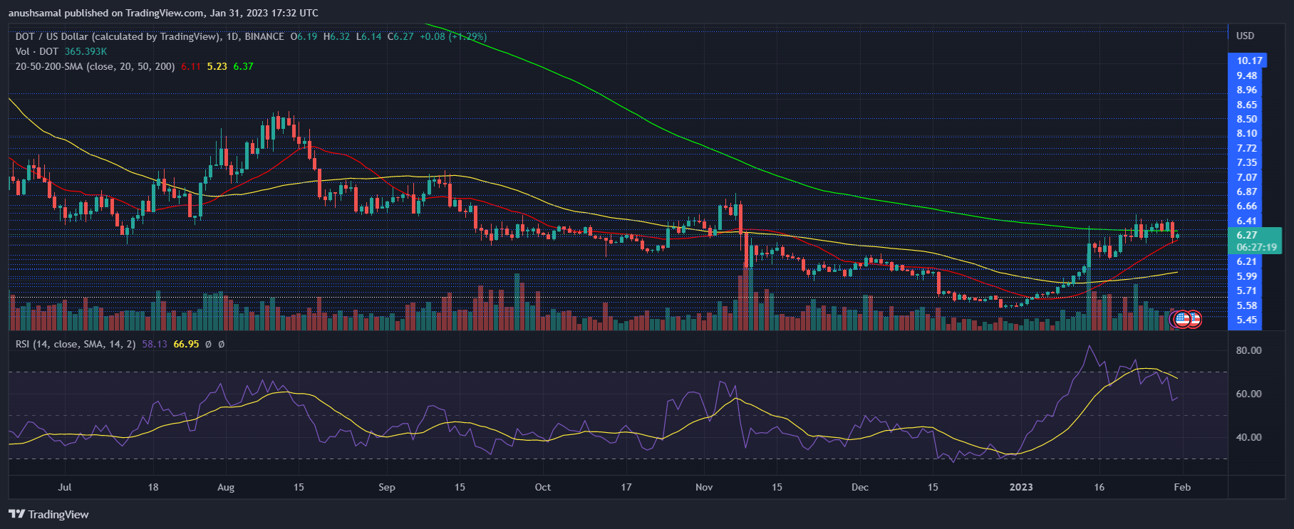
The altcoin has fallen from the overbought region, contributing to the recent price correction. The Relative Strength Index was below the 60 mark, but it displayed an increase in buying strength. Buyers still had power over the sellers in the market.
A fall in demand will bring DOT below its immediate support line. The price of the altcoin was slightly above the 20-Simple Moving Average (SMA) line, which implied that buyers were driving the price momentum in the market.
About DOT losing momentum over the subsequent trading sessions, it formed a death cross in the chart. A death cross occurs when the longer moving average crosses above the shorter moving average, in this case, the 50-SMA (yellow) line going above the 20-SMA (red) line. A death spiral is usually followed by a fall in the asset’s value.

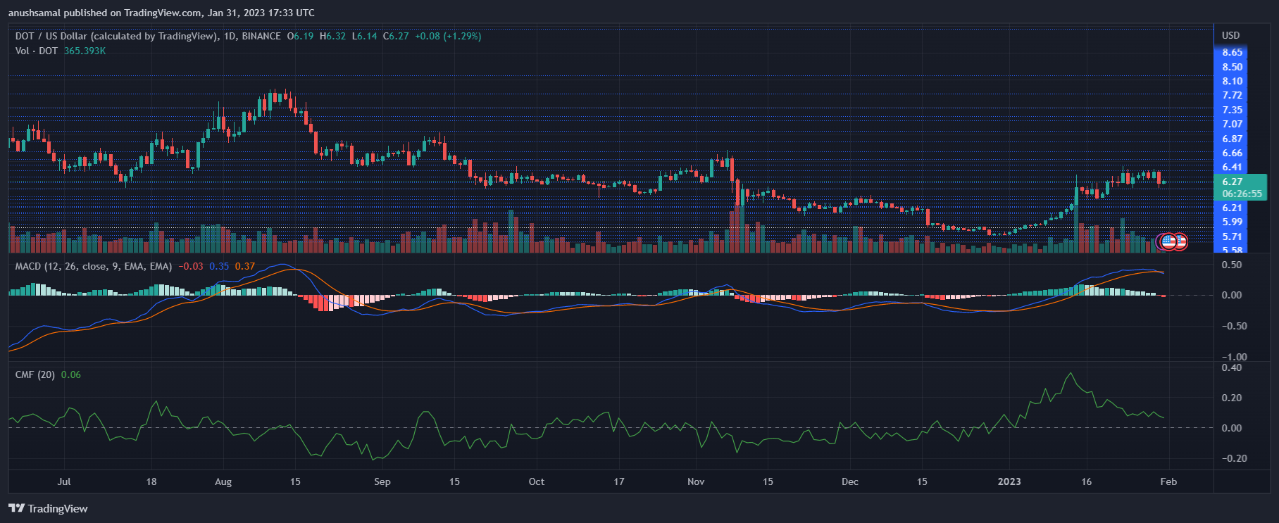
Other technical indicators showed that the bullish signal was weakening. Moving Average Convergence Divergence indicates a change in price momentum and a trend reversal. The indicator underwent a bearish crossover and formed red signal bars related to a sell signal.
A sell signal often means that the price is headed for a dip. On the same note, capital inflows noted a decline, although they were still in the positive zone.
The Chaikin Money Flow measures capital inflows and outflows at a given point. The indicator dipped closer to the half-line, meaning capital inflows fell on the one-day chart.
from NewsBTC https://ift.tt/dP62lYA
via IFTTT
Comments
Post a Comment